I'm a simple emigrant, and they created a new design for Hesse
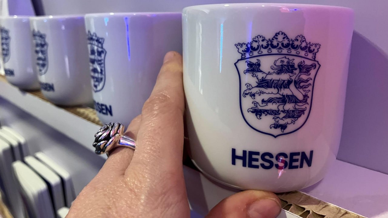
Hesse, the land where I live, turned 80 this year. In honor of the anniversary the local government decided to update the land’s branding. Because it wasn’t stylish-fashionable-young enough. With the old coat of arms it really had become unbearable to live! The government’s idea was good – to raise the spirit of patriotism and the sense of community among local residents. The thing is, Hesse is very diverse. Here historically there has been a high percentage of emigrants. And in the biggest city, Frankfurt, there are many visitors and people who live here temporarily. And the government decided, now we’ll make a new branding style, and people will rush to hug each other. Everyone: me in a kokoshnik, and girls in paranja, and guys in leather shorts will run to lead round dances, holding hands. But there’s a snag: first, when you do something for people, of course you don’t need to ask them. You can simply say here’s the new style, now be friends! Second, we spent 300,000 euros on the new emblem and branding, but only the old emblem remains legally and officially in place. Therefore the new emblem is kind of there, but kind of just so I can put it in a post, say. Got it? I don’t quite either. If they did unite the people, it was only against themselves. People were outraged, saying that the education budget is being cut, and here they gave so much, and the result is rather mediocre. Moreover, 300 thousand is only the fee for developing the style itself, not updating the entire product line, not implementation, not even a fashion show where, to techno music, they presented the new design – nothing of this was included in that amount. So the real price remains to be seen. Personally, what saddens me more is not the expenses themselves, but the result. I don’t see in it either the uniqueness of Hesse, nor any idea of self-identity. In my opinion, it’s just nothing. Such a logo could have been at a beer joint near Zavodoukovsk. And that shade of blue is too standard. There was also a red version in the fashion show — there the lion looks like a Chinese dragon. And what do you think of the design? #holidays #frankfurt #money photo © picture alliance/dpa | Sandra Trauner